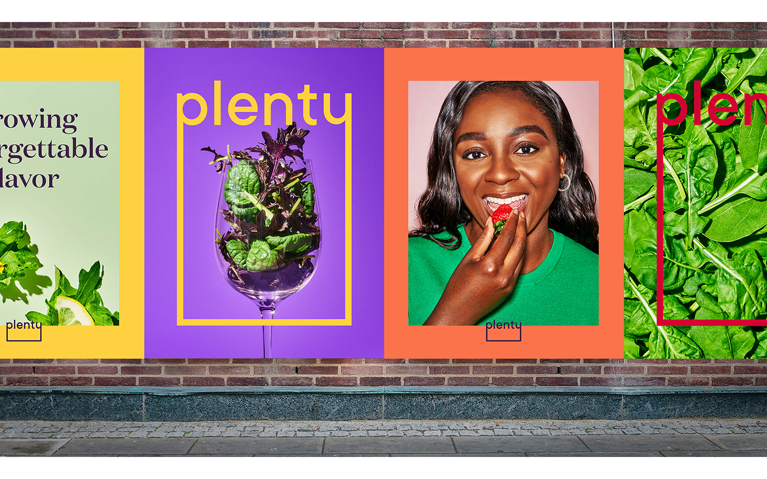
Plenty
We teamed up with Plenty to craft an upbeat and innovative rebrand for the Silicon Valley based vertical farming startup.
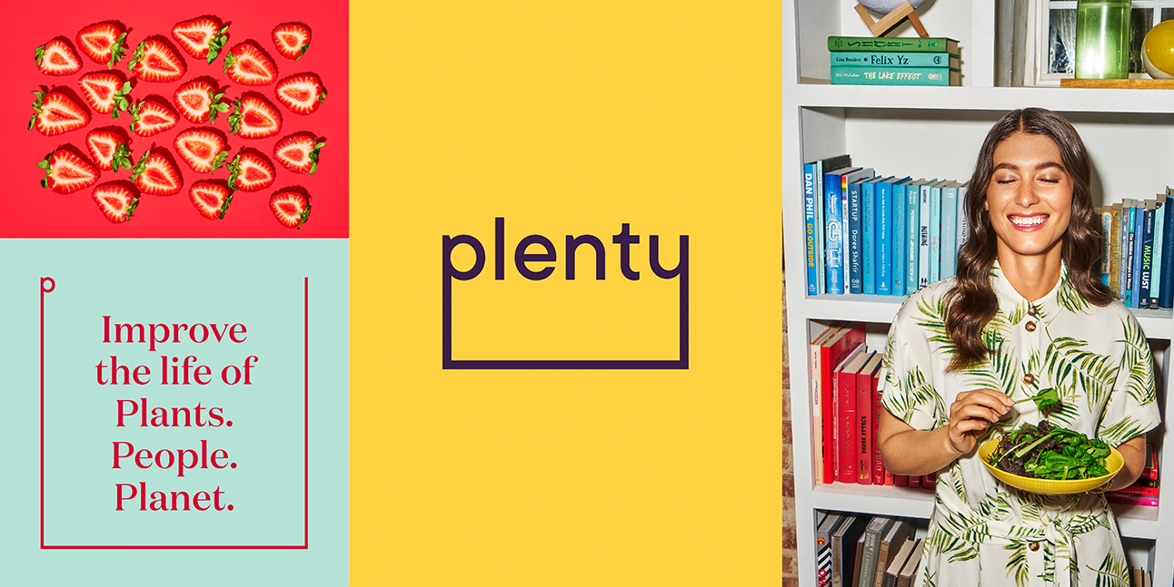
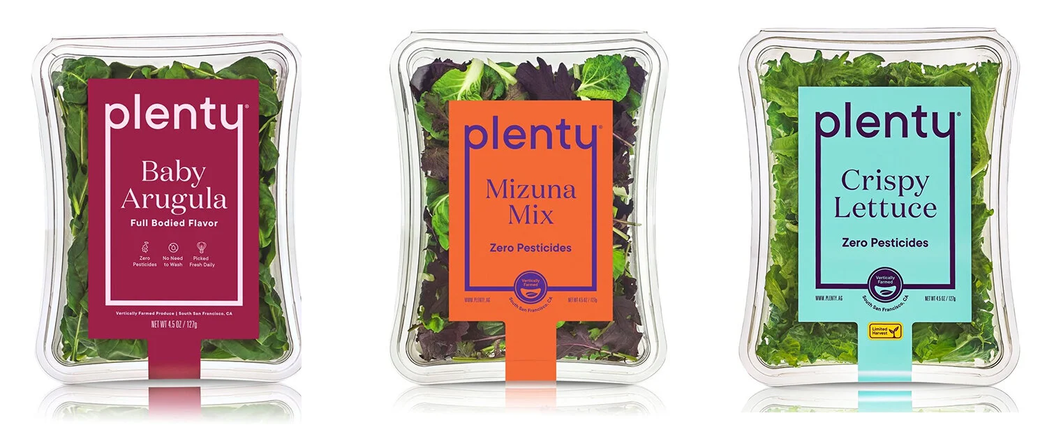
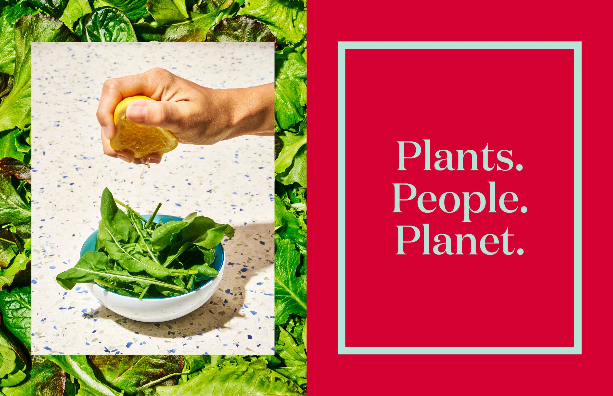
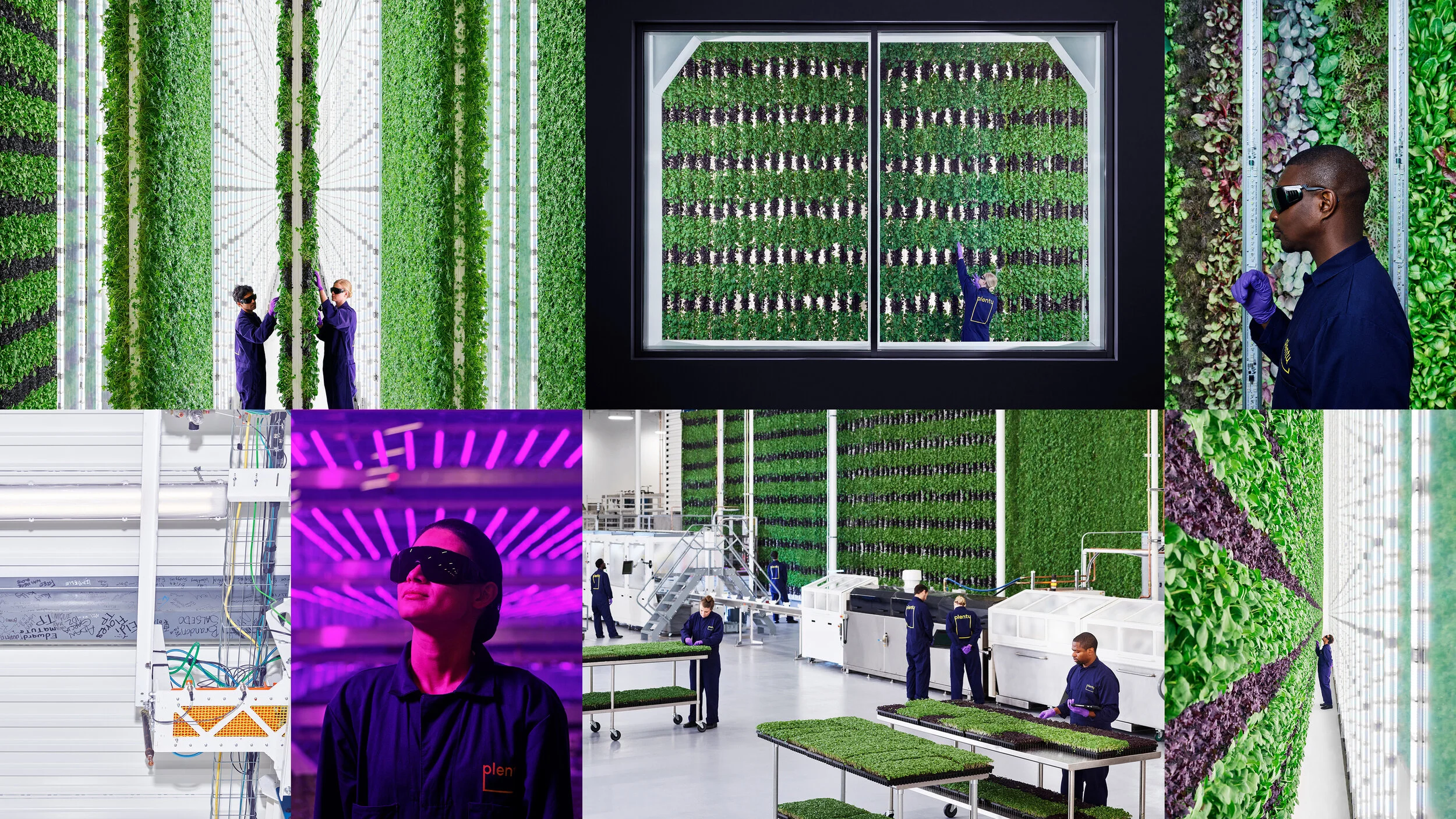
Plenty uses indoor, vertical farming to shine a new light on the way we do food. This kind of farming calls for less time, space, and resources while yielding fresh,
craveable produce that improves the lives of plants, people and the planet.
We were tasked with creating a visual ID that brought to life the consumer-first and visionary brand, while also being flexible and revolutionary.
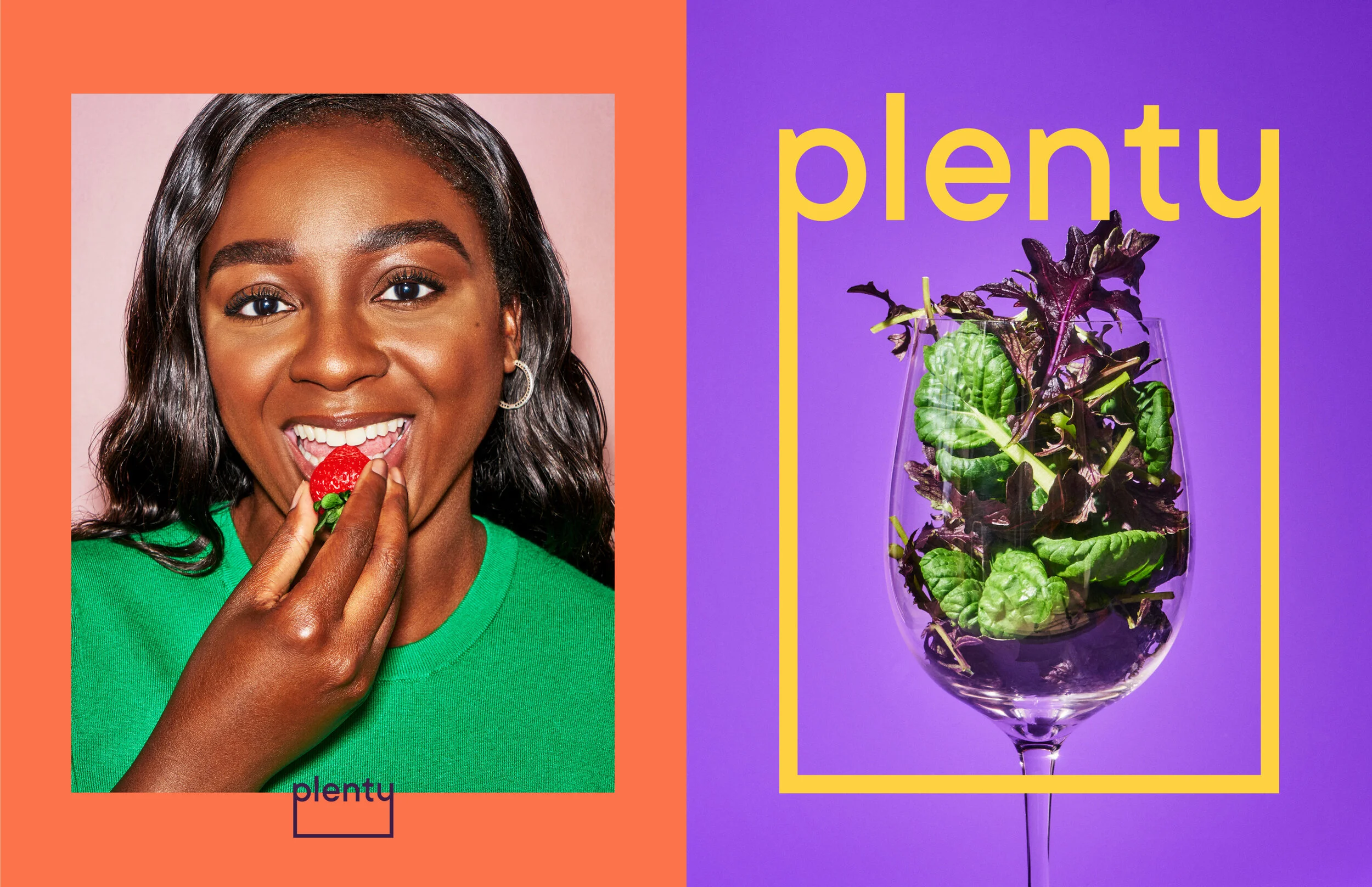
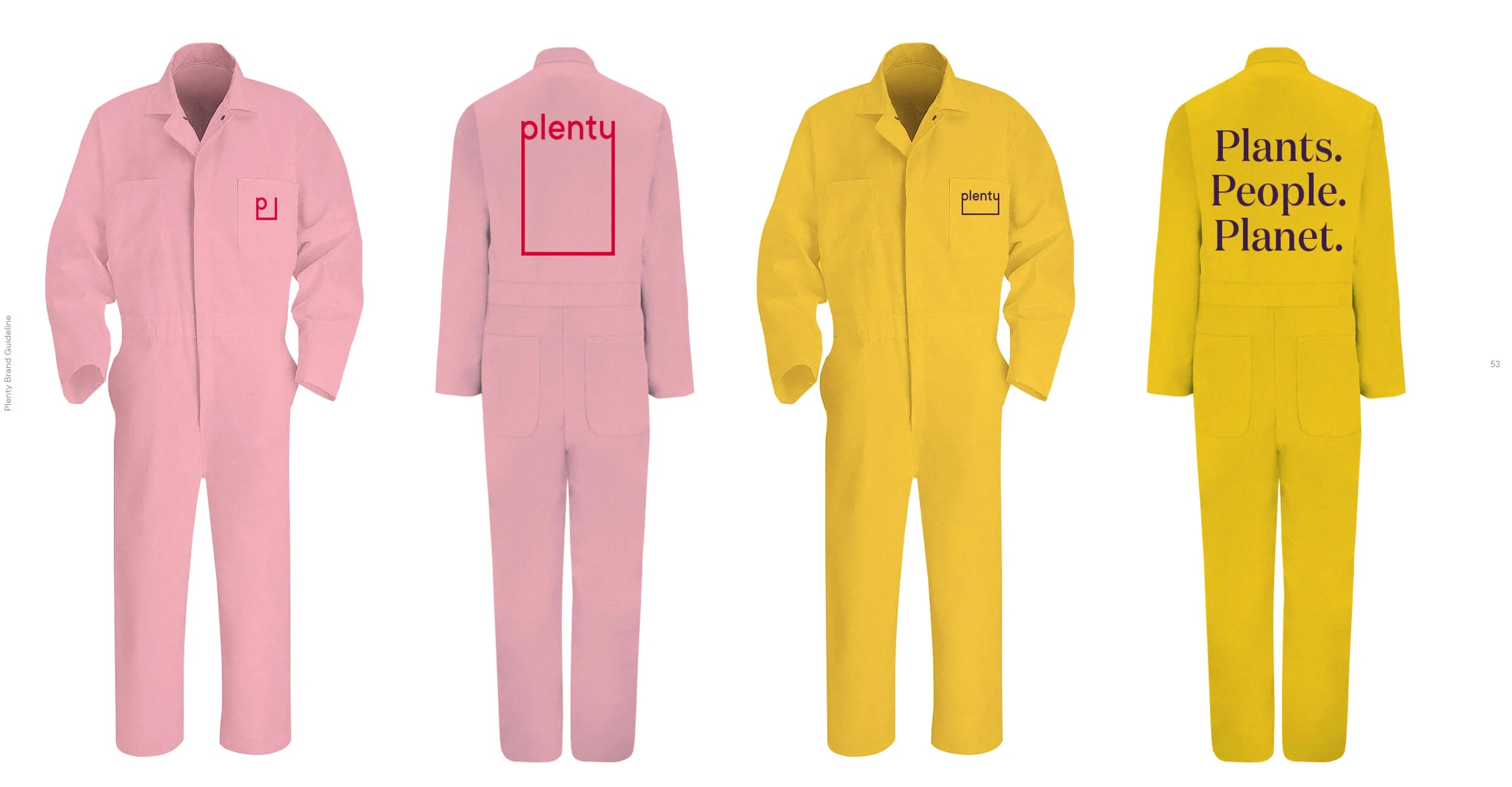
We developed the logo with what we called “The Plenty Frame” which is a graphic device that gives the produce a stage.
This simple frame has the ability to highlight the verticality of Plenty’s innovative farming. The P and the Y are able to extend,
representing growth from ground to harvest and from our brand to the world. The resulting shape also refers to the ever-growing perimeter of Plenty’s farming walls.
Rounded shapes in the logo letters send a more sensual message for the brand to signify both flavor and feeling.
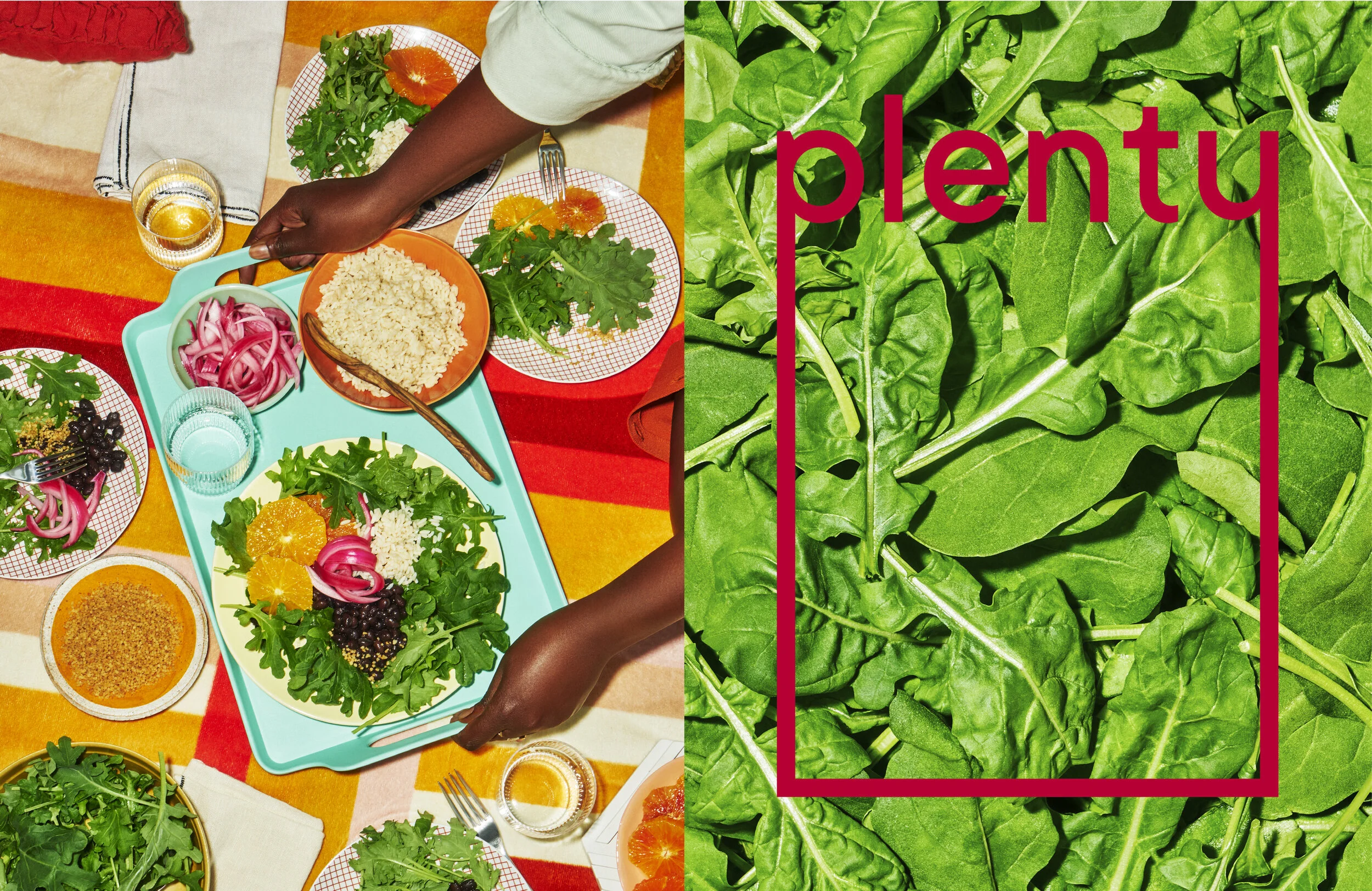
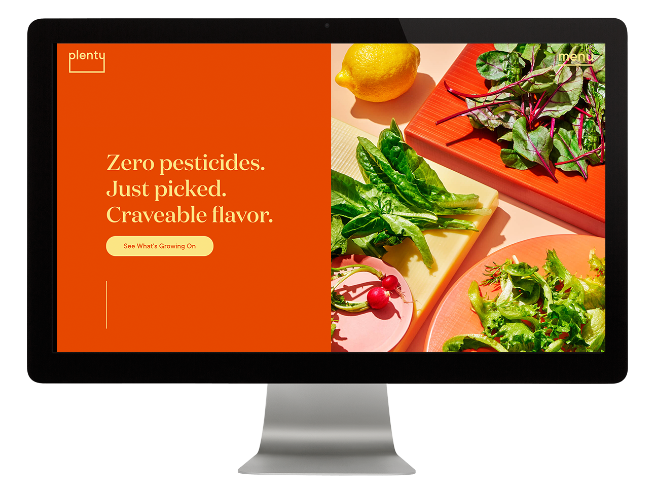
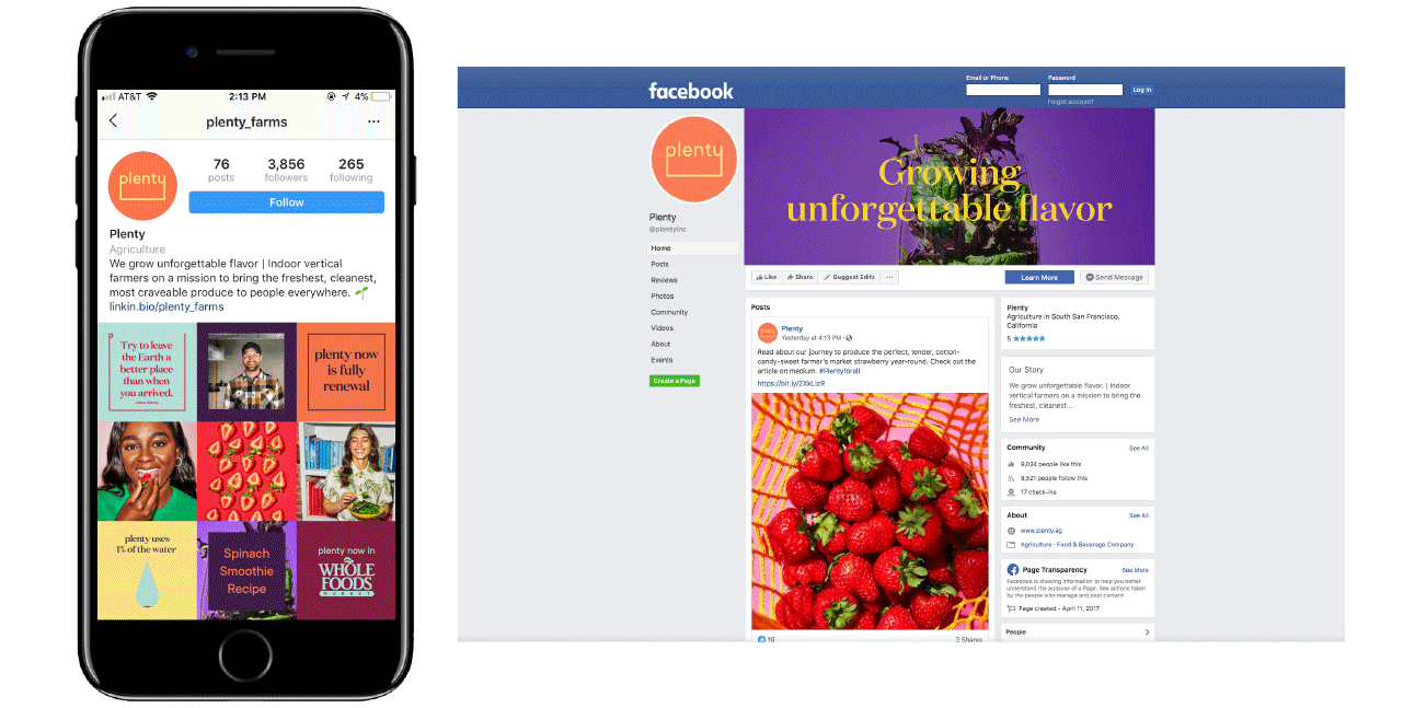
This came through developing brand guidelines, social media look and feel, and a website redesign.
Website |. Instagram